Last year I took a trip to Amsterdam, it was my first time travelling on my own so I was somewhat overwhelmed, scared, nervous, excited you name it 😟. So once I arrived in the Netherlands it was down to me to navigate my way from Schipol airport right up to my accommodation.. Yes, I did get lost but that's a story for another time.
I have chosen to discuss the wayfinding system present at Schipol airport simply because I had to navigate to and from the airport on my travels.
Concept innovation - I wasn't originally aware of this at the time of my journey (probably why I got lost) but the airport have a beacon which aims to improve passenger experience. The airport allows you to connect onto their free Wifi and travellers with a smart phone are able to gain access to a KLM app, so long as they also turn on the blue tooth on their device. But to summarise the app, once it has been downloaded you have access to a detailed map, complete with personalised directions, it shows the passenger/s how long it will take to get to your destination (for example transferring to another flight from Schipol airport) and the route you need to take via the map.
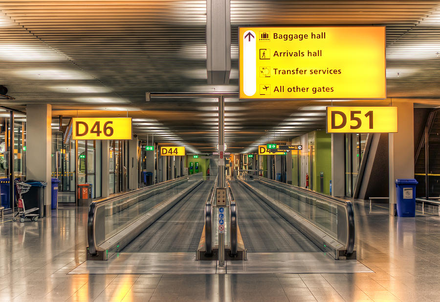
Strength - In 1967 a colour coded wayfinding system was introduced at the airport, the yellow signs seen in the image below denote flight information whereas the green indicates all the exits at the airport something that is quite familiar with a few other international airports. At the airport, graphic designer Benno Wissing and interior designer Kho Liang le introduced the colour coded sign system with bare essential messaging. I think using the colour coded system was effective in its means of visual communication, because signs and systems need to be clear, concise and easy to understand and I felt this was achieved with the simple use of aesthetics. Such was the wayfinding systems success of the Schipol airport there were modern versions created in several airports worldwide for instance, New York, Athens, Eindhoven, Frankfurt, Abu Dhabi and Aruba to name a few.

Weaknesses - Deaths from a fire at Dusseldorf airport in 1996 were attributed to the use of ineffective exit signage, and so the Schipol airport system was was refined in order to increase the visibility of the exit signage and I would presume safety of passengers. Green was adopted as the exclusive colour to help passengers identify the escape routes accompanied by the emergency exit symbol. There were a few signs at this airport that were (disabled access, parking and no smoking) repeated quite a few times and so I feel this could perhaps have been used to communicate another signage for something also quite important like transfers, however arguably you could say that these are the more important pieces of information hence it's frequent usage in the wayfinding system.


No comments:
Post a Comment